The Music: Postal Service, Esbjorn Svensson Trio, Fat Freddies Drop
The Drink: A nice cup of Tea
The Weather: Sunny but my toes are frozen
The Mood: Sleep deprived grumpiness; cured/exacerbated by cups of tea.
Hi all,
I hope you haven't given up on me. Its been a busy time, but I've finally sat down to do some tutorialising (a valid word ?).
Old English Lettering here we go:
In the interests of brevity I wont go into the history of this script but to say that it has Germanic origins and is perhaps best know for being the type used to print Johannes Gutenbergs 42 line Bible - the first book to be produced using movable type.

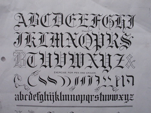
The secret to lettering, I think, is to try to mechanically deconstruct the elements that make up a letter, and understand the basic building blocks that make up a particular alphabet. Once this is done you can build it up again into a legible alphabet.
This really helps with Old English, which can look very confusing, but actually is made up of only a few basic shapes.
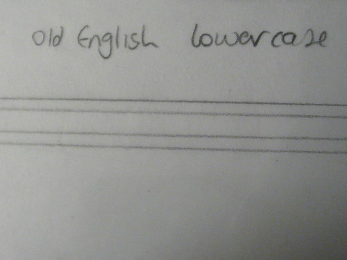
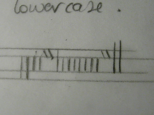
Lowercase first.
This drawing shows the three main 'axes' of an OE letter.
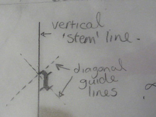
This is what the drawing guidelines look like.
and the letters are pretty much broken down into the following shapes
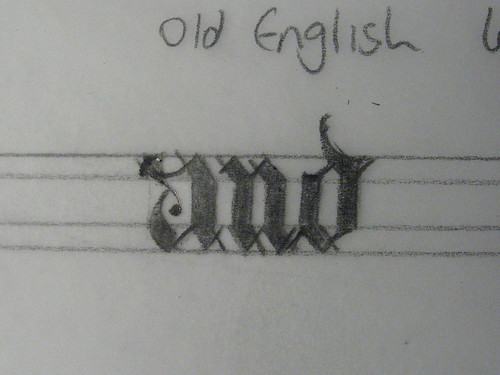
I'll demonstrate how I draw OE with two examples below.
The first word is 'and' and the second is 'jewel'
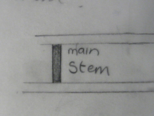
First I draw on the main stems - I draw the outline of the stem rather than just a single line like I did with the other lettering styles.
I keep the gaps in between stems just about the same as the stem thickness. Width between letters is also about the same thickness as the main stem.

OK It looks very confusing, I admit, but this is what works for me. Fear not! It will start to make sense.
I always have a copy of the alphabet in front of me for reference.
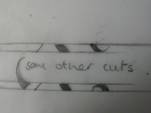
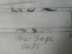
The next step is to draw in the diagonals and other cuts like the swirly bit for the 'a'


Come on, admit - its starting to look like something now. ermm. Maybe.
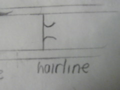
Next is to draw the hairline diagonals that complete the letter.

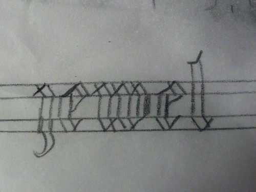
And finally, I just coloured it in, so that you can see the letters more clearly - I obviously wouldn't do this when pointing on to the metal
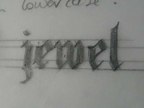
Cool hey!
Caps
Capitals are between two-thirds bigger and double the height of lower case letters - depending on how much space you have on the area to be engraved. Mine will be closer to 2/3rds.
To be honest I dont really have a method that I use for doing the Caps like I do the lowecase. I just take each letter individually as it comes. Still, there are basic elements to most of the Capital letters.
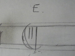
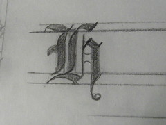
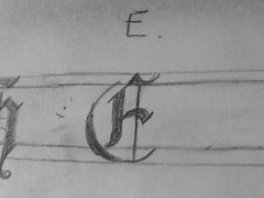
I'm going to demonstrate the H, E and J.
These are the basic elements
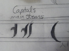
Draw on guidelines, then draw the main stems
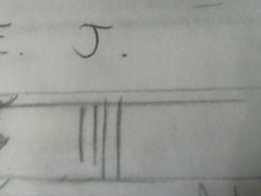

Add in the other diagonals/curves then hairline cuts.
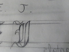
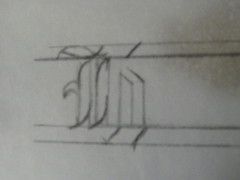
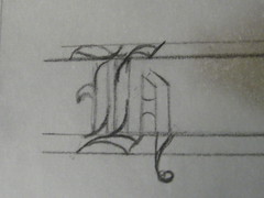
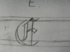
Voila!

I'll add the drawing for my actual plate later. Right now its time to catch some shut-eye.