I've been working on the blue layer. That's finally done. As I said earlier I had been removing the excess ink with a barely-damp cotton swab. Well, I'm a little concerned about pushing wet ink around, I think that's more likely to result in colors intermixing where they shouldn't.
When I finish with one particular color, I apply several coats of Renaissance Wax. Again, I'm all sorts of low tech. Smear it on, let it dry, buff it down, repeat a few times. This will hopefully keep newly applied ink from sticking to previous color layers, though you still need to be REALLY careful with inking, and don't deliberately put one color over another unless you are hoping they'll mix.
Anyway, I make a zillion stippled dots, apply the ink with a tiny brush (the thing I DO like about using this drawing ink is I can be more precise with the inking, you can't brush on etching ink), and now instead of wiping it away with something damp I'm pretty much just buffing it down when it's dry. It takes some doing, but it's doable, and seems to result in less color pollution, for lack of a better term. I'm using a scrap of fabric from nylon stockings, which is soft enough not to scratch but has enough texture that it will (eventually) rub the ink off. Feel free to try other things!

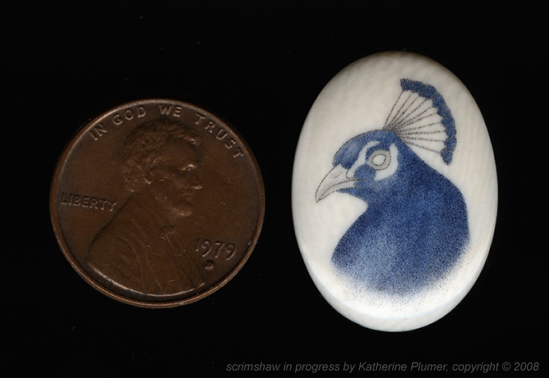
And here's how it looks now. In hindsight this blue color isn't quite right. It's not bright enough. I should have mixed in just a smidge of white, but I'm really not going to worry about that, because the good new is that so far this is working and that's super duper.

I shouldn't be too celebratory yet though because the darker colors are really going to test this out!