Okay, somewhere around this point I decided I'd better figure out how I'm going to do this. Translating a photo into colored pencil is one thing. Translating a photo into a stippled-scrimmed ink image that would fit on a thumbnail, well that's a whole different beast.
For one thing it needs to be somewhat simplified, I mean let's face it, that's really small. So although if I was going to draw this is as really top notch colored pencil piece I would probably end up using at least 15 colors, that's a little overkill for inking a scrim.
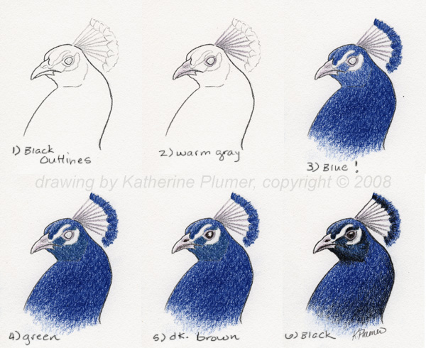
But mentally trying to translate the photo into color scrim was tough. How many colors? How to do the gradations? In what order to overlap colors? I decided to forget the photo and make a new reference image, a drawing. In the interest of simplicity I reduced it to 5 colors (black, pale warm gray, blue, blue-green, dark brown), and I drew it exactly how I intend to scrim it. I'm certainly not saying you'd have to do that, it's just what works for me. Really that's all any of this is, what works for me (still learning!)

So here's the plan! Yes, I'm going to try to scrim from light to dark! This is my colored pencil "reference image."